Providing Health Information to
Users with Low Health Literacy Skills
Research, Evaluation, Usability Testing & Design of a Mobile Interface


Image source: Google Images
Overview
Communicate Health (CH) is a health education and communication firm that strives to bring clear and simple health information to audiences with limited health literacy skills. The goal of our project is to get a deeper understanding of the user’s space, emotions, activities, and actions when they are trying to access or comprehend health information online. We are using a user-centric approach to identify issues faced with the current user experience of the healthfinder.gov mobile website, understand the effect of the users’ context on their current practices of browsing, viewing, and comprehending health information online, and propose a redesign of the interface to address these challenges.
Role
Researcher
Interaction Designer
Client
CommunicateHealth
Team Members
Molli Udis
Tripti Rajput
Shiva Ghasemi
Chenxi Liu
CJ Huang
Duration
3 months
Background
About CommunicateHealth
Communicate Health (CH) is a health education and communication firm that strives to bring clear and simple health information to audiences with limited health literacy skills. For the past several decades, CH has researched and developed insights for designing digital health information. They particularly focused on research and development for designing digital health information for limited health literacy populations. In 2015, along with the HHS Office of Disease Prevention and Health Promotion (ODPHP), CH released the 2nd edition of “Health Literacy Online”, a guide for creating simplified digital health tools, which specifically targets limited health literacy populations.
Their Previous Research
CH has done extensive research and analysis about accessing health information using desktop websites. Through eye-tracking research, they found that when users are reading health information on a desktop web page, they tend to focus more on the center of the screen either skipping vital information or alternately reading word-for-word and re-reading sections resulting in low retention and comprehension. Since many limited literacy users are smartphone-dependent for seeking health information, it is imperative to extend health literacy research further to designing for mobile devices.
About the Interface
We are evaluating the healthfinder.gov mobile website which is a free government website that provides information and tools for individuals to live a healthy life. Healthfinder.gov won multiple awards including the ClearMark Award for best plain language. Healthfinder.gov complies with the Section 508 Accessibility Requirements in Rehabilitation Act and the U.S. Department of Health and Human Services (HHS) Secretary’s Section 508 Implementation Policy to make the website accessible to the widest population. The site was developed and is maintained by the Office of Disease Prevention and Health Promotion (ODPHP).

Image source: Google Images
Project Details
target users & recruitment
-
Individuals with limited health literacy skills (focused in the United States) who wish to access, understand, and use health information online.
-
Includes:
-
those who struggle with literacy
-
people belonging to ESL
-
older adults
-
racial or ethnic minorities with compromised health status
-
those who seek health information but are not regularly online
-
-
We use the following proxy measures to identify our target users:
-
Education - high school-level education or lower
-
Household income - less than $50k per year
-
Health information-seeking behavior - do not regularly seek health information online
-
perceived problems
-
Users are more likely to skip whole sections on a page or alternatively read word-for-word.
-
The way health information is written impacts the reading speed, comprehension, and retention. When health information is complex, reading speed decreases.
-
Users face trouble navigating websites and using a search engine for finding desired health information. They often get distracted by hyperlinks and excessive search results, clicking on multiple links or losing focus in their search.
research questions
-
How does the users’ context or space affect their current practices of browsing, viewing, and consuming health information online?
-
What are the challenges faced with the current user experience?
-
How can mobile content be structured to facilitate effective scanning, reading, and comprehension and reduce content skipping?
-
What is the optimal design and navigation on a mobile web page for users with limited health literacy skills?
-
What mobile design elements best facilitate scanning, reading, and comprehension and reduce content skipping?
assumptions & scope
-
Users are more likely to use mobile phones over computers to access health information because of the availability of WiFi and ease of access.
-
We use proxy measures for identifying our target users.
-
We will not be exploring best writing or content design practices (already done by CH); we are exploring the best content organization practices.
Methodology
CONTEXTUAL INQUIRY

Image: Brainstorming of the initial research plan

interviews & interpretation
-
Conducted 8 contextual interviews
-
Interviews were taken at:
-
Public libraries
-
Senior centers
-
Community centers
-
-
Population
-
Age range: 19- 80 yrs
-
6 female, 2 male
-
affinity diagramming
-
Performing affinity diagramming to identify challenges, user needs, and expectations from health literacy sources online
experience modeling
-
Creating 2-3 different models that cover the collected data
-
Identify model
-
Sensation board
-
Search-in-the-life (modification of day-in-the-life)
-
-
Identifying key issues and coming up with "hot ideas" to address them
-
Coming up with outlines of product concepts based on our findings
GENERATING HOT IDEAS & PRODUCT CONCEPTS
INTERVIEWS & INTERPRETATIONS
The following is an outline of our interview guide:
Interview Questions
-
Do you use any particular website(s) online to access information on health? If yes, could you tell us more about it/them?
-
Could you tell us if you like/dislike anything in particular about it?
-
Could you tell us how easy/difficult you find it to use?
-
Could you tell us about any issues you may have faced using it? How did you resolve them?
-
Anything you would want to change or add to it?
-
-
So I saw that you access health information online ______ number of times/frequently.
-
Could you tell us when exactly you access this information?
-
What kind of information do you access online? Could you tell us more about it?
-
What do you use to access this information online?
-
How do you use the information you access online?
-
-
What other ways do you access health information in? Could you give us an example of what you mean?
-
What kind of issues do you face when exploring or accessing health information online? Could you elaborate upon them?
-
Where do you access or look up health information? (home, library, cyber-cafe, health center, etc)
-
Do you access information online alone or prefer having somebody with you or someone to aid you with the process? Do you take assistance or help when accessing health information?
-
If yes, what kind of help? Or what do you need help with and why?
-
If yes, who do you prefer having alongside you?
-
-
Could you tell me about your most recent experience making a health-related decision?
-
Did you access health information online to make the decision? If yes, can you tell us more about your experience?
-
What resources did you use?
-
What did you like/dislike about the experience?
-
Could you tell us about any issues you faced? How did you resolve them?
-
-
-
Could you tell me about a time when you really needed to access important health information online? Could you walk us through your experience?
-
Could you tell us how you were feeling at that point in time?
-
What did you like/dislike about the experience?
-
Could you tell us about any issues you faced? How did you resolve them?
-
Is there something you would have wanted to change or add to the website to make your experience better?
-
Observing Participant Using healthfinder.gov
-
Go to healthfinder.gov website
-
Use it to search for a topic that you care about most right now.
-
Try to find information from the page that is most useful for you and read it out. (helps us see how people scroll through the information and effect of pagination)
Follow-up to Participant Observation Session
-
What did you like/dislike about the website? Tell us more about it
-
Is there something you would have wanted to change or add to the website to make your experience better?
-
Anything else you would want to tell us about your experience using the website?
-
Could you tell us how easy/difficult you found it to use? How easy/difficult was it to find the information you wanted?
-
Could you tell us if there were parts that were frustrating for you to use?
-
Is there any more information you would want the website to have?
-
-
Is there any particular area you want to explore on the website? (Health information, about disease, insurance, finding health centers, etc).
AFFINITY DIAGRAMMING
Based on our contextual interviews and interpretations, we created an affinity diagram to better understand our data. Below is out work-in-progress physical affinity diagram created using sticky notes. Each yellow note represents a data point from the users' interviews; the blue notes are the low-level themes that are grouped under the pink notes which are the higher-level themes. The green notes represent the high-level problem statements identified from the data.


Final Affinity Diagram
EXPERIENCE MODELS

Identity Model
Relationship Model
Sensation Board
ISSUES LIST
BROKEN ELEMENTS
-
Interface didn’t adjust like Kindle, have to scroll sideways to read.
-
Site is not updated with all the topics users want to search for.
-
Some of the hyperlinks on the website were not working as expected, redirecting the user to places that do not contain their desired information.
-
The font size decreases as users go deeper into hyperlinks of articles, requiring users to zoom into the text to read it.
-
Hard to understand from some of the headings on the website what a particular article is about.
OPPORTUNITY ELEMENTS
-
Regular text could be mistaken as hyperlinked text.
-
Some of the font sizes are hard to read.
-
Hard to interact with / press some of the small icons.
-
All information displayed at once in the articles is overwhelming.
-
Challenging to understand the content because of a language barrier.
-
Challenges understanding health-related terminology used in articles.
-
"Meaningful” pictures and videos for better understanding and conceptualizing information currently missing from articles.
-
Desire to consult trusted people about their health.
-
Difficulty in trusting health information on different websites.
OTHER DETAILS
-
Need for assistance from other people to understand the content or navigate through all the health content online.
-
Need to share information with family members and friends.
-
Age and gender-based search.
-
Need for different colors for different types of texts such as headings and hyperlinks.
-
Appreciated short, concise, and sectioned content.
-
Cross-referenced information from different sources to double-check its validity.
-
Liked when technologies “probed” them in the form of reminders, emails, updates, etc.
-
Liked relevant articles related to search popping up along with the search results.
-
Accessing health information using computers slower as compared to on smartphone.
-
Did not like story style content.
-
Did not like when some health information-providing webpages ask them to first sign up.
-
Difficulty self-diagnosing from online health information.
HOT IDEAS LIST
SLOGAN
-
“Easy access no matter who, where and how.”
-
More accessible and responsive textual and visual content.
-
Make the content available online less confusing and easy to find.
-
-
“Well-Structured, well informed.”
-
Sectionalized and well-formatted layout of the content
-
Information in the form of bullet points, bolded headings, and easily-differentiable hyperlinks
-
Neatly formatted and easily scannable content
-
Easily differentiable headings and overview sections for articles
-
A list of section and subsection titles of the article
-
Health information specific to different age and gender categories
-
-
“Keep users informed even they’re not searching”
-
An option to subscribe to regular update emails and messages about relevant health topics.
-
Timed reminders to regularly log in or check my health information.
-
STRUCTURED CONTENT
-
Structured Content
-
Sectionalized and well-formatted layout of the content
-
Interactive videos and pictures as a part of articles
-
Information in the form of bullet points, bolded headings, and easily-differentiable hyperlinks
USER EXPERIENCE CHALLENGE
-
“Focus experience.”
-
No distractions such as advertisements
-
Efficient results for my searches
-
-
“Searching health information does not require a steep learning curve”
-
Different search tools and explanations about which can be optimally used in which cases.
-
Quick onboarding process to guide me through the interface.
-
DATA CHALLENGE
-
“Raise users’ ability to get access to the essential metadata”
-
Tell me when the information was last updated.
-
Tell me the source of the information
-
Show me if professionals approve this information
-
Give me more links to supporting information and data
-
-
“Extract just enough living tips and precautions for users”
-
General health precautions to follow a healthy lifestyle
-
Information about general healthy living tips and precautions for my family and me to follow
-
METAPHOR
-
“A social media/platform for health information”
-
A way for people to directly share the information found on a webpage with others.
-
A social support platform to discuss health-related topics and own problems.
-
-
“A Wikipedia for health”
-
Definition of health-related terms before using them in the text or hover explanation for terms
-
An appendix for health-related terminology
-
Health-related terms translated into my own language
-
Way to contact professionals for clarifications about terminology
-
OPTIMIZED SEARCH TOOLS
-
Easy to use search tools and efficient results for people with different search habits
-
Voice assistant to speed up user’s experience to find their intended article
-
Good defaults and suggested data can help users both reduce mistakes and increase productivity.
-
Auto-suggestions as quickly as possible, such as after the third character is entered, to provide immediate value and reduce users’ data entry effort.
-
Recent users' searches are saved in app to accelerate users' experience.
-
Related articles / information shows up along with the search results
TECHNOLOGY CHALLENGE
-
“Comparison platform for health insurance”
-
A way to get information about family health and insurance plans and compare them
-
Information about different health insurance plans
-
“Searching Assistant”
-
Provide suggestions while I am searching for the information.
-
Automated personal assistant on the website to guide people to find the relevant information they need.
-
Service to help find and book appointments with doctors or health providers
-
“Personalization”
-
Health information according to different categories such as age, gender, etc
-
Personalized health information and tailored treatment plans based on my age, gender, and specific needs
CREDIBLE CONTENT
-
More information in the form of “learn more” hyperlinks to different webpages so that users who like to cross-validate information can be assured of the credibility the provided information
-
Supporting statistics as a part of the article content
-
Information about professionals’ rating or backing of article content
-
Information about the source(s) of the website content
PRODUCT CONCEPTS
Since our project involved studying an existing product (healthfinder.gov mobile website), we did not generate entirely “new” product concepts but instead came up with concepts and ideas to improve the current user experience of the website.


USABILITY TESTING
First Round: With Existing Mobile Interface of healthfinder.gov
-
Conducted the study with 6 participants
-
Demographics of participants:
-
Age range: 19 to 69-year old
-
2 male, 4 female
-
All participants were comfortable speaking English.
-
None of the participants worked in market research, none had participated in market research, and none were healthcare experts.
-
Every participant used the internet daily; 4 used an iPhone and 2 used an Android.
-
3 participants had a high school diploma as their highest education level and 3 had some college as their highest education level.
-
3 were African American participants, 2 were Hispanic, and 1 was Asian / African American.
-
3 participants had a household income between 20,000 to 34,000 and 3 had a household income between 50,000 to 74,000.
-
2 participants sought health information online weekly, 1 less frequently, 2 daily, and 1 once a month.
-
Usability Test Tasks and Guide
WARM-UP QUESTIONS
-
Tell me a little about yourself.
-
What do you typically search for online related to your health?
-
What websites do you use to find health information?
-
How frequently do you look for health information online?
SITE FREE EXPLORE TASK
Use the website as you would do on your own. As you use the site to gain information about topics of your choice, think aloud and make sure to tell me whatever comes in your head going over the content.
FORMATIVE TASKS
From the topics mentioned, show me which one you would want to know more about and read a full article on it.
Topics: flu, diabetes, breast cancer, depression
TASK 1 (Long Article)
TASK 2 (Long Article)
Now, show me which article from the list you want to read and read it using the view all option or by section option (depending on what option the user chose earlier, choose the option they didn’t do earlier).
Topics: flu, diabetes, breast cancer, depression
TASK 3 (Short Article)
Pick a third article (without any pagination or view all) from the listed topics and read it.
Topics: diabetes, breast cancer, depression
FOLLOW-UP QUESTIONS AFTER EACH FORMATIVE TASK
-
Describe in your own words what the article meant to you.
-
Can you tell me about any questions you have after reading the article?
-
Can you tell me if you learned something new from reading the article?
-
Can you tell me about the experience going through the content of the article?
-
(if needed) What, if anything, did you like about what you read in this article?
-
(if needed) What, if anything, was confusing or complex?
-
(if needed) What, if anything, is currently missing from this webpage?
-
SUMMATIVE TASKS
Find a list of seafood items that a mother should include in her diet when she is breastfeeding
TASK 1
TASK 2
Find a list of 5 home tips that can be followed to keep ticks away from your home
TASK 3
Check on the website and tell me, for a 40-year old male, how often should they get their blood pressure checked?
TASK 4
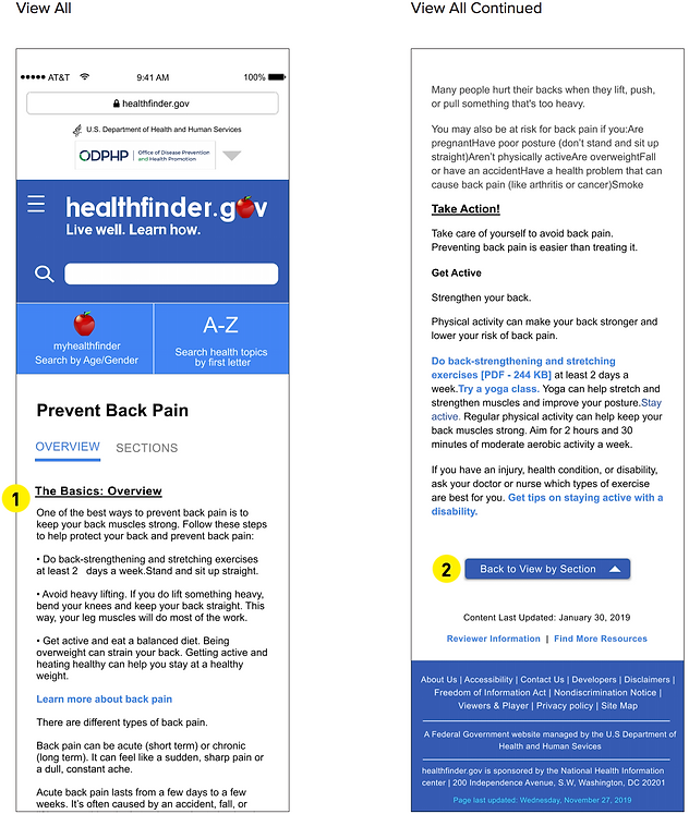
Find a list of 6 exercises that help strengthen and stretch your back and prevent back pain.
REFLECTIONS / CLOSING QUESTIONS
-
Did you find the website easy or hard to go about? Why?
-
Did you find the article easy or hard to understand? Why?
-
Describe your overall experience
-
What, if anything, did you like about the website?
-
What, if anything, did you dislike?
-
If you could wave a magic wand and change or add anything to this website, what would it be?
-
How likely are you to use the website again? Why or why not?
-
On a scale of 1 to 5 (1 being never using this website again and 5 being will definitely use this website), can you rate how likely you are to use this website again?
-
Key Findings, Analysis & Design Considerations
WEBSITE TOOLS
-
A-Z health topics list - many participants used that to successfully complete the summative tasks.
-
Identified issues:
-
Participants often clicked on the wrong letter and had to go back and click on the letter they initially intended to click.
-
Some of the participants did not scroll down far enough on the homepage to see this tool.
-
-
Possible design considerations:
-
Move the A-Z list further up the homepage, possible right underneath the search bar so users see it within the same vicinity as the search bar.
-
Have two A-Z health topics list one at the top and one at the bottom, so if a user scrolls all the way to the bottom they don’t have to scroll all the way back to the top to use it. But it is also at the top of the page for users that might miss it at the bottom.
-
For fewer errors, the letters should be bigger and spaced out more.
-
-
-
The MyHealthFinder tool was intended to be used for the third summative task but none of the participants used this and instead used the search bar or A-Z health topics list.
-
Possible design considerations:
-
More clearly define what the tool is and make it more predominant on the page so users can see it and use it.
-
-
CONTENT VISIBILITY
-
Some users could not differentiate between what was and what was not a hyperlink.
-
Possible design consideration:
-
Make the color contrast more drastic so users can clearly identify the difference between the black text and the link (the current hyperlink color is cerulean, which blends in with the black text more than, say, a red).
-
-
-
Some users read word for word through the article.
-
Some content got cut off on the smaller mobile screen
-
Possible design consideration:
-
The website needs to be responsive so no content is lost on the edges of the page.
-
-
-
When a participant used the A-Z health topics list and clicked on the letter B for bites the webpage directed her to “insect bites”. The articles were placed at the very top of the page and the user did not see them.
-
Possible design consideration:
-
Make the visibility of the headings more clear so the user doesn’t have to read the whole article word for word; they can instead find the heading and then read further into that part of the article.
-
For the articles that were placed at the top of the page where the participant missed seeing them, it would be more helpful if they were in the center so the user sees them immediately.
-
-
VIEWING OPTIMIZATION
-
In our formative tasks, we asked the viewers to look at an article in the view all and by sections structure. We had participants comment that the view all is helpful because all the information is there at once, but it is a bit overwhelming. One participant stated that it is a hassle to keep clicking the next section at the bottom of the page. We observed that only some participants used the drop-down menu to see all the section options that were in the article.
-
Possible design considerations:
-
To optimize the reading structure, make the drop-down menu to browse all sections more visible and obvious so more participants can try using it.
-
Restructure the view by section button at the bottom so users can still view by section but with more information about the upcoming sections.
-
-
-
We also observed that when participants click "view all", it brings them back to the beginning of the page and they have scroll back down to find where they finished reading.
-
Possible design considerations:
-
When the user clicks "view all", the article will just expand so the user doesn’t lose their place.
-
-
CONTENT OPTIMIZATION
-
Some of our users were confused with the content in the article, wanted more information, or wanted a different structure for the information. If it is a service, some users felt it would be helpful to include a helpline number to the take action section.
-
One participant felt that one section should have been above another one.
-
Possible design consideration:
-
Analysis should be done on how to best order the information on the page.
-
-
-
When users typed a long search in the search bar, the result either did not seem relevant to their search or there was no result, or keywords from their search did not show in the article title or small summary, or the search couldn’t correct misspellings.
-
Possible design consideration:
-
Make sure it’s clear to the user the connection between the title of the article and the content.
-
If a user has a long search and they get to the articles page, there should be some visual indicator that an article has certain keywords in it from their search even if it is not in the title.
-
The search should recognize misspellings and have a suggestion like Google where it says “showing results for” (this would be with correct suggested spelling) and underneath is the users misspelling, “search instead for” (which has the users misspelling).
-
Another solution would be a built-in speech button on the search so users don’t have to worry about spelling.
-
-


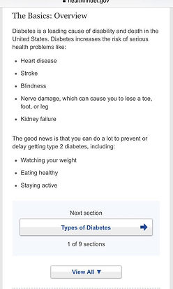

Popular health topics
Search bar
A-Z Health Topics list
MyHealthFinder tool
Bug bites example which just redirects to another topic
Section-wise view
View all option
Wrong search just shows "no results"

Task Performance - Summative Tasks


Improved Interface
INITIAL SKETCHES
The sketches below are the initial design ideas our team drew out to get the improved interface ideas flowing. We started by looking at the landing homepage and what changes we can do to improve it.

-
A-Z health topics tool: In the current homepage the A-Z search health topics tool is not visible until the user scrolls down. We wanted the tool to be visible when the user first opens the page.
-
ODPHP and U.S Department of Health and Human Services logos: We put two logos next to each other so they take up less room on the page.
-
Search Icon: To optimize the space on the landing page we put it next to the healthfinder logo.
-
The rest of the page would be the same structure order (in this version we took out the suggested health article from the original landing page).
The three search tools on healthfinder.gov are the search bar, A-Z health topics search, and the myhealthfinder tool. The next design consideration our team discussed was how to present these tools so users could find and use them easily.

-
In the current homepage the A-Z health topics search tool and the myhealthfinder tool is not within view when the user first lands on the homepage. The user must scroll down to see it.
-
Search Tools: We played around with ideas to move these tools to the top of the page for the user to see when they first get to the page. We tried putting the search icon, the A-Z, and myhealthfinder in a row of three at the top underneath the healthfinder.gov logo.
-
Search Tools 2: The second version of the three tools at the top of the page is the A-Z tool and the myhealthfinder tool on the same line and the search icon above it on the same line as the healthfinder logo. This version gives more room for the A-Z and the myhealthfinder buttons.
The next design ideas we discussed were first, the “section by section” and “view all” options when the user reads an article. Second, we observed that participants did not use the “browse sections” tool so we ideated a modification that would make that option more visible for users to see and use.


-
The current website “browse sections” drop-down menu.
-
The current website “section by section” and “view all” options.
-
In our design, we wanted the “browse sections” option on the same line as the overview header so they are in the same line of vision in the hopes that users don’t miss it.
-
We played with the idea of having another set of buttons that would allow the user to go back to the first or last section in addition to navigating to the next or previous section.
-
Another idea was to have all the section headings written at the top and not in a drop-down menu. 6. We wanted to get rid of the light blue box behind the view by sections option and find a different way to separate “view by section” and “view all.”
REFINED LOW-FIDELITY PROTOTYPE
The sketches below are based on the initial sketches. We took each of the ideas and expanded it further and draw out a more clear sketch to help guide us in our later wireframe. We started with the homepage.
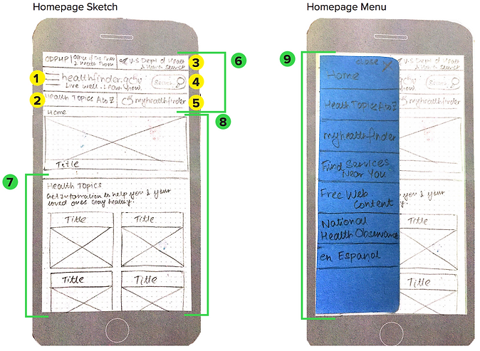
-
Hamburger menu
-
The A-Z health topics list shorthand (button - when clicked will drop-down to view the alphabet)
-
Both header logos merged into 1 row to save space
-
Search bar
-
myhealthfinder (by age and gender). Short search option similar to the A-Z search
-
The website header stays throughout all the pages
-
List of popular health topics
-
The rest of the homepage structure stays the same as the original interface (everything after scrolling down also stays the same)
-
The menu opens up by pressing the hamburger menu icon. The menu closes using the “x” button on the top right corner.
Homepage sketches continued: After looking at the layout and menu of the homepage we discussed further ideas for the search tools.

-
myhealthfinder button at the top of the homepage so users don’t miss it. We decided to make it a button on the top of the page and included in the constant header on every page to make it easily accessible.
-
This is the pop up view of the myhealthfinder tool. It is activated when the user presses the button. The pop up is the same content in the new sketch as it is in the original website.
-
A-Z Health Topics search tool button also at the top of the homepage. Same as the myhealthfinder, this button is on the constant header on every page to make it easy for users to use the A-Z method without having to go back to the homepage.
-
This is a pop up of the A-Z Health Topics search tool. It is activated when the user presses the button. The content design is the same as the original website.
Article Sketches: After looking at the homepage the next important page to make design considerations was the interface for the health articles.

-
Option to view the overview
-
The rest of the article underneath
-
Next section button with sufficient explanation and position indicator
-
Header stays constant on all pages
-
Fading lines of text, subtly prompting the user to click on “view all” content view if they want to see the full article at once.
Article Sketches Continued: Brainstorming and sketching different ideas to best show the different article sections instead of the original drop-down menu on the current website.
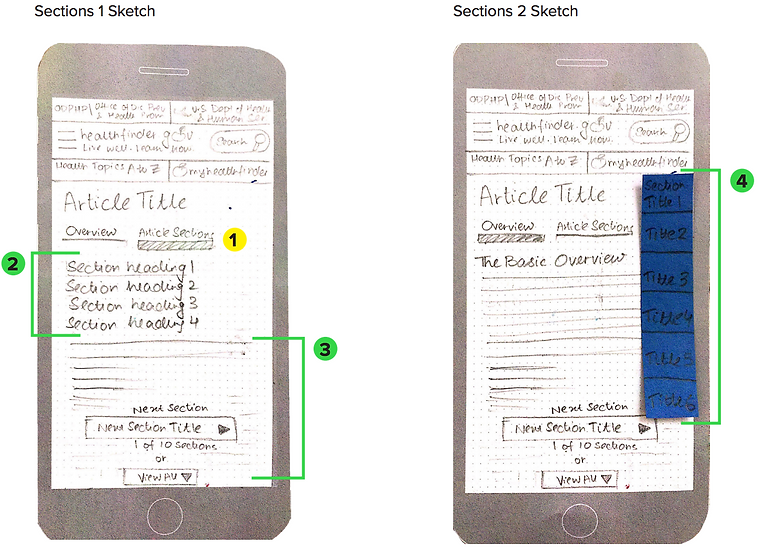
-
Bread crumb / underline indicating which view is selected (Shown here is the article section view).
-
Section headings are hyperlinked to the respective section pages.
-
The text of the article (particular section) starts.
-
When the user scrolls down the article (in the “view all” option), a translucent section heading menu shows up so the user knows which section they are reading. They can click on the side menu to easily get to another section at any point in the article not scrolling to the top or bottom.
WIREFRAME MOCKUPS
The wireframes below are based on the refined sketches from the above section. These wireframes will be used for our second usability testing and we will be creating live interactions for the users to navigate through the mockups. Below is the homepage exploration.

-
Added the other two logos at the top
-
Made the healthfinder logo bigger
-
In the homepage version 1, the three search options were at the top which made them a bit squishy. Also since the search bar is so frequently used, changed it so the user can still see the whole search bar. Underneath are the other two search options unique to this site.
-
Took out the suggested article to read from the original website (it seemed unnecessary and took up space).
-
The letters are more spaced out than the original website to help people make fewer errors clicking on a letter.
-
The buttons are the same style with a slight drop shadow so users know it is a button and not just text in a blue square.

-
Example of the three search options at the top. The user has to click on the search button to use it.
-
In the second view, the search bar is always present and the user clicks on the A-Z or the myhealthfinder tool as a pop-up.
-
The myhealthfinder tool was not selected so it is slightly faded out so the user knows which selection they made.

-
The menu drops down and shifts all of the content down. It may not be obvious where the menu options end.
-
In the updated interface the menu slides out from the left in a blue box. This visual helps the user know exactly what is in the menu bar.
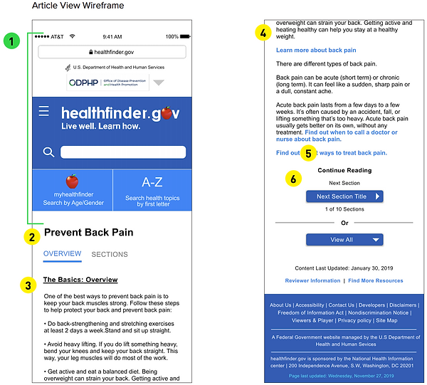
-
This header section stays on every page so the user can easily find the three search options without going back to the homepage.
-
The header of the article is in a bold black, not blue so users do not confuse it with a hyperlink.
-
The basics overview (and other section headers) are bold and underlined so users can easily and rapidly find each section header.
-
The hyperlinks are in blue. Any text that is not a hyperlink is black.
-
Added the text continue reading to show the user there is more in the article.
-
The “next section” and “view all” buttons are the same style as the homepage buttons for continuity

-
The first option to present the sections in the article is by clicking “sections” the headings drop down and the text content is shifted down.
-
The second option is to have a drop-down menu that goes over the content without moving the content further down the page.

-
When the user scrolls fast down the page (in the “view all” reading option) a side bar will appear to show the user all of the sections in the article and the section they are in will be the 100% opacity and the sections that are in the article but not where the user is currently on the page will have 65% opacity. The user can click on the other sections to get to it faster than scrolling up to the top of the page or trying to find the section header in the article.
-
The first option to present the sections in the article is by clicking “sections” the headings drop down and the text content is shifted down.
-
The second option is to have a drop-down menu that goes over the content without moving the content further down the page.
Meet the team!
